Color Theory Basics for Miniature Painters
Learn color theory for miniature painting: how to pick color schemes, use complementary colors, and make your minis look great on the table.
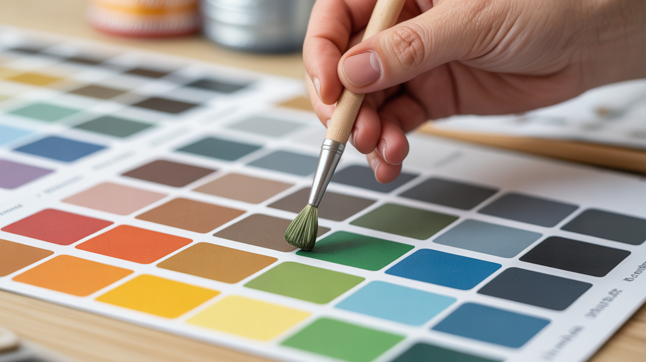
Color theory sounds academic, but for miniature painting it comes down to a handful of practical rules. Nail those and your minis will read clearly from across the table, even if your technique is still developing.
The Color Wheel and Why It Matters
The color wheel organizes twelve colors into a circle. Red, yellow, and blue are the primary colors. Orange, green, and violet sit between them as secondaries. The rest are tertiaries, blends of a primary and its neighboring secondary.
Two positions on the wheel matter most to painters:
- Analogous colors sit next to each other (blue, blue-green, green). They create a calm, unified look.
- Complementary colors sit directly opposite (blue and orange, red and green, yellow and violet). They create contrast and visual pop.
You do not need to memorize the whole wheel. Just remember that a small accent of a complementary color on a mostly warm mini adds instant energy, and analogous palettes give you a cohesive look with very little effort.
Choosing a Color Scheme for Miniatures
Before you pick up a brush, decide on three things: a dominant color, a secondary color, and an accent.
A simple starting formula is the 60-30-10 split:
- 60% dominant color (armor, robes, body)
- 30% secondary color (leather, clothing, hair)
- 10% accent (gems, eyes, OSL glow, weapon runes)
This keeps the mini readable without being boring. If you want the accent to stand out, pick something on the opposite side of the color wheel from your dominant.
Practical examples:
| Dominant | Secondary | Accent | Result |
|---|---|---|---|
| Cool grey armor | Brown leather | Orange gemstone | Classic fantasy warrior |
| Warm green skin | Dirty cloth | Red eye glow | Menacing orc |
| Deep blue robe | Light tan scroll | Gold trim | Noble wizard |
| Black fur | Dark leather | Teal eyes | Mysterious rogue |
If you struggle with picking colors, look at reference photos from video games, comics, or concept art. Experienced artists already solved the palette problem for you.
Warm, Cool, and Neutral Colors
Warm colors (reds, oranges, yellows) read as active and forward. Cool colors (blues, greens, violets) read as calm and receding. Neutrals (browns, greys, tans, off-whites) anchor a palette and stop it from feeling chaotic.
Most minis benefit from a mix of warm and cool tones. An all-cool palette can look lifeless; an all-warm palette can feel overwhelming.
A trick that professional painters use: shade warm colors with a cool shade and shade cool colors with a warm shade. Blue armor shaded with a purple-brown wash looks richer than blue armor shaded with a darker blue. Red skin shaded with a cool violet looks more natural than red shaded with dark red. This is because real shadows pick up reflected light from the environment, which is usually a different temperature than the lit surface.
Value: The Unsung Hero of Painting
Value means how light or dark a color is. A strong value structure often matters more than the colors you choose.
If you photograph your mini and desaturate the image to black and white, the different zones should still be clearly visible. If everything blurs into one grey blob, the value range is too narrow.
When your paints are going on too thick, value contrast suffers first because you lose the fine transitions between highlights and shadows. Getting paint consistency right is as important as picking the right colors.
Value tips for beginners:
- Base coat at mid-value for the color
- Wash to add the dark range (recesses, details, depth)
- Drybrush or highlight to add the light range (raised edges, top surfaces)
Three values, applied in that order, will make almost any color scheme look intentional.
Complementary Colors in Practice
Using complementary colors painting is one of the fastest ways to make a mini look finished. The human eye reads complementary pairs as vibrant because neither color can cancel the other out.
A few applications:
- Gems and eyes: If your armor is blue, paint gems orange. If armor is green, use red or magenta for the glow.
- Basing: A desert-sand base under a cool blue mini adds contrast without touching the figure itself. A green mossy base does the same under warm orange skin tones.
- Lighting effects (OSL): A warm candlelight glow on a figure painted in cool blues looks believable because the two temperatures contrast.
You do not need a vibrant accent. Even a muted, desaturated version of the complement works. Burnt orange pairs with steel blue as well as vivid orange does, and often looks more realistic.
If you want to push contrast further but find brushmarks are distracting, check out the guide on how to get rid of brush marks on miniatures before you move to smaller detail work.
Speeding Up Your Process With a Unified Palette
One underrated color theory trick: pick one neutral that appears in every zone of the mini. A warm tan, a grey, an off-white. This ties different colors together and makes the overall look feel deliberate.
It also speeds you up. If you mix a drop of the same off-white into each highlight, the mini gains a unified ambient light source without extra planning. This is one reason painting miniatures faster without them looking bad often comes down to palette decisions made before you start, not to brushwork shortcuts.
Frequently Asked Questions
Do I need to study color theory before I start painting?
No. You can get a good result from a single mini by following the 60-30-10 split and adding a small complementary accent. Color theory is useful for understanding why something works or does not work, not as a prerequisite to starting.
What if I pick colors that clash?
Try desaturating one of them. A muted, greyed-down version of a color rarely clashes. You can also separate them with a neutral (a thin line of gold trim, a strip of brown leather) to stop two colors from fighting each other directly.
Can I just copy a color scheme I saw online?
Absolutely. Reference is a legitimate tool. Many experienced painters keep a folder of color schemes they like. Copying a scheme exactly teaches you how it was constructed, which you can then adapt for future projects.
Do different paint brands use different color theories?
Color theory itself is universal. Individual brands organize their ranges differently (some group by function like base, shade, layer; others by color family), but the underlying color relationships are the same across all of them. Always follow the manufacturer's safety instructions, including proper ventilation when spraying primers or using an airbrush.
How do I make a color scheme for a whole army, not just one mini?
Pick two or three colors as the army palette, then use the 60-30-10 split consistently across every figure. Variation within those colors is fine. Squads can have different secondary colors as long as the dominant reads the same. This way the army looks cohesive from a distance even if individual minis vary up close.